Add an info hotspot (infotation) to a scene
Add an infotation to a scene, choose a variant, write the title and an HTML description, add a picture, and see what visitors get and what to check.
Guide6 min read Updated
On this page
The short answer
To add an information hotspot, which the editor calls an infotation, open the Hotspots tab, click a scene, click Add Infotation and click the picture where it should sit. In Hotspot Properties choose a Variant, type a Title and a Description / Content, and add a picture if you like. The description takes HTML, not Markdown. Visitors click or tap the badge to open it.
Who can do it
- The owner, and collaborators whose role includes the Hotspots Tab and the Panoramrs Tab: Editors and Admins by default (what each tab does).
- The Basic view lists seven variants: Use Global Setting, Classic Panel, Modern Tooltip, Video, Image Gallery, Audio Narration (Play/Pause) and External Web Link. Simple Tooltip, Full Modal Popup, Pulsing Icon, Audio Narration (Popup Player) and E-Commerce Product are in the Advanced view, with Color Override, Share with other Tours and Hotspot Preset (Basic and Advanced). A hotspot that already has one of those variants keeps it in its list.
- Any plan. The popup style is part of a theme: a tour in a Pro theme that has never been hosted, on a Free plan, shows the free Default look on its public page, so its popup style is the default one. A tour in a free theme, the Default Theme, and a tour that is, or has been, hosted, or whose owner is on a paid plan, shows your own popup style (What you get on a Free account).
Add an infotation
- Open the tour, click the Hotspots tab and click a scene in the Panoramas list.
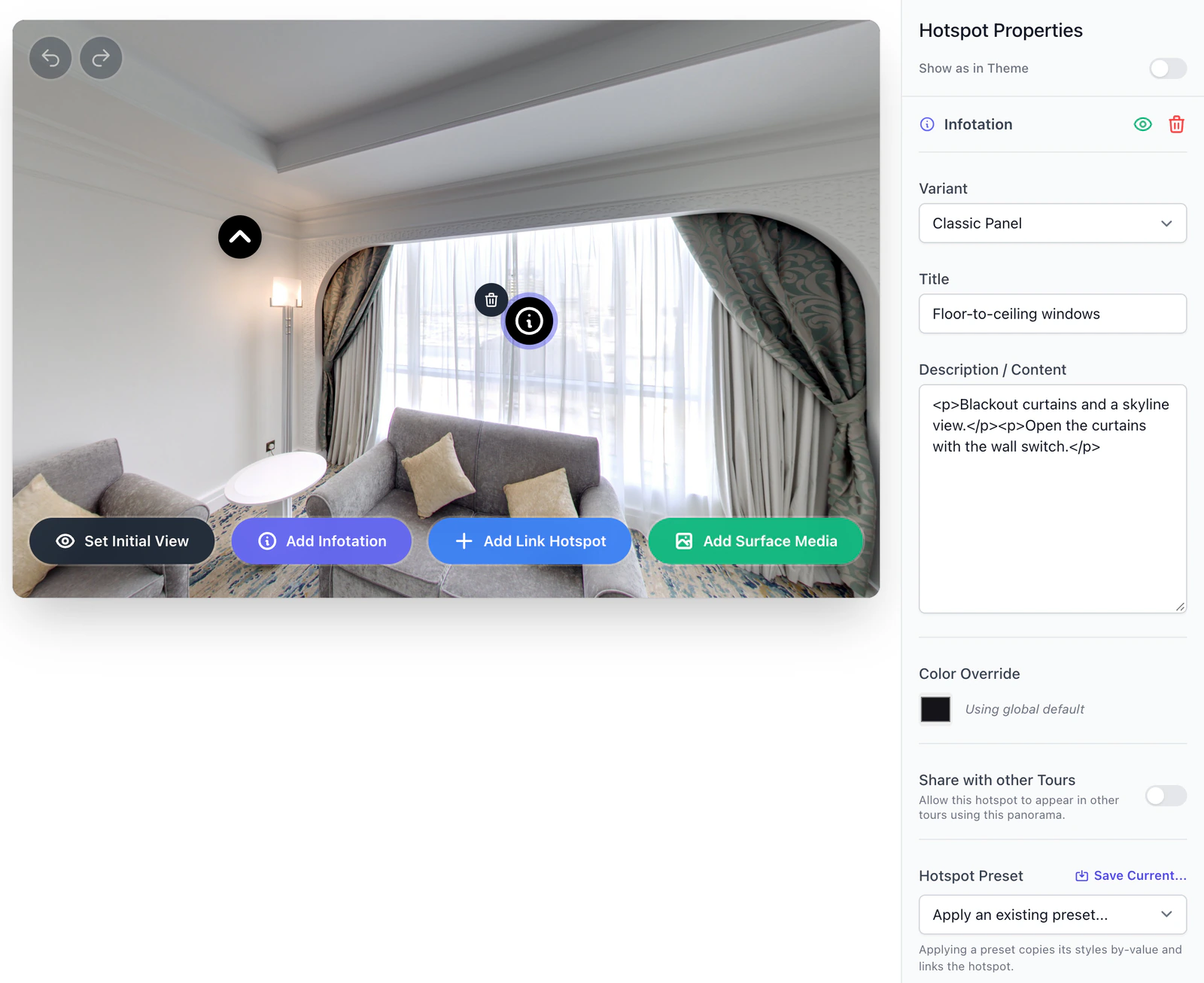
- Click Add Infotation at the bottom of the picture. A message reads
Click the panorama to place the infotation. - Click where the badge should go. Enter puts it in the middle of the view, and Esc cancels.
- Hotspot Properties opens with the heading Infotation and the variant Classic Panel. Fill in the fields below.
There is no Save button: a change is saved half a second after your last one. Ctrl+Z (Cmd+Z on a Mac) undoes it. Hotspot types lists every field of every variant.
Choose a variant
| Variant | What visitors get |
|---|---|
| Classic Panel, Modern Tooltip, Full Modal Popup, Use Global Setting | The tour's popup style (below) |
| Simple Tooltip | A one-line label when the visitor points at the badge. It has only Label Description |
| Pulsing Icon | A panel under the badge, with a ring pulsing around the badge |
| Video, Image Gallery, Audio Narration (Play/Pause), Audio Narration (Popup Player) | See the video, gallery and audio guides |
| E-Commerce Product | A window with the picture, text and price, and a Buy Now link when you fill in Checkout URL |
| External Web Link | The address in Target URL opens in a new tab. The player does not show the Button Text |
The tour's popup style is set for the whole tour: Design tab, Hotspots Setup panel, Information Popup Component (in the Advanced view). The choices are Collapsible Content Box (the default), Lightweight Hover Tooltip and Immersive Full-Screen Modal. The published player draws Classic Panel, Modern Tooltip, Full Modal Popup and Use Global Setting in that style, whichever you pick for the hotspot. Change the style there, not here: the Design tab is for the owner and Admins by default, and Save & Render keeps the change.
Write the text
Title is the heading of the popup. Leave it empty and the player shows no heading. Description / Content is the body. It takes HTML, so Markdown marks such as **bold** show as typed. A new line you type may not show as a line break: write <br> for a line break and <p>...</p> for a paragraph. If the tour has extra languages, the text goes into the language chosen under Editing: (how languages work).
<p>Original oak floor, refinished in 2024.</p>
<p><a href="https://example.com/spec" target="_blank" rel="noopener">Floor specification</a></p>
When the tour is built, Panoramr keeps ordinary formatting (headings, paragraphs, lists, tables, links) and removes scripts, forms, frames and every class, style and event attribute. A link whose address uses a scheme other than http, https or mailto, such as javascript: or tel:, loses its address. Add target="_blank" to open a link in a new tab. The Title box stops at 100 characters.
Add a picture
Under Media URL (Optional), type a picture's address or click Browse. The picker lists your pictures, with Upload new to add one. A JPEG or PNG you upload is saved as a WebP at most 2,000 pixels wide or tall; an SVG or an animated GIF is kept as it is. Classic Panel has no picture box: choose another variant. The popup shows the first address only. For several pictures use an image gallery.
On the live site the tour's page lists where pictures may come from: Panoramr's own addresses and storage, and a few map and Google services. A picture linked from any other website stays empty, so upload it.
Color, sharing and presets
- Color Override gives this badge its own color instead of the tour's hotspot color. Clear Override removes it.
- Share with other Tours is off for a new hotspot. Another tour that uses the same panorama shows the hotspot only when it is on: see Share hotspots between tours.
- Hotspot Preset applies a saved color and variant to the hotspot (looks and presets).
What visitors see
The badge shows the tour's info icon (the video, gallery, audio, shop and link variants have icons of their own). A click or tap opens the popup; the hover tooltip style also opens when a visitor points at the badge. A visitor can reach the badge with Tab and open it with Enter or Space. Only one popup is open at a time. Esc, the X, a click on the panorama, or moving to another scene closes it (in the Immersive Full-Screen Modal style, and in an E-Commerce window, a click on the dark area around the popup does not: use the X or Esc), and autorotation pauses while one is open.
The editor does not open the popup: clicking a badge there selects it. To try the popup, open the Preview tab and click the badge there.
When visitors see it
A save refreshes the stored copy of the tour that visitors get, unless the tour has Draft Workflows on: then visitors see it after you click Publish Changes. See My changes do not show for visitors.
Troubleshooting
The popup shows asterisks or # signs, or my line breaks are gone. The description is HTML. Use <b>, <p> and <br>.
The popup looks different from the variant I chose. The tour's popup style decides: see above.
The picture does not show. It is on another website (upload it and use Browse), the variant is Classic Panel, or it is not the first address in the box.
I cannot type a longer title. The Title box allows 100 characters, and then shows Character limit reached (100 max).
Visitors do not see the hotspot. It is hidden in this tour, it was made in another tour and is not shared, or the change has not reached them yet: see Hotspot types.
Next steps
Was this article helpful?