Customize the player's bars, sidebar and gallery
Which bars, sidebars and panels the tour player shows, which are on by default and which need Advanced: the top bars, Icon Bar, Side Nav - List Menu and more.
Reference7 min read Updated
On this page
The short answer
The Design tab lists a panel for each part of the tour player's screen under Component Modules. Most bars have their own switch: a new tour starts with the Top Nav Bar - Dropdown, Bottom Nav - Thumbnails and the Floorplan Minimap on, and the Icon Bar, Side Nav - List Menu and the Top Nav Bar - Multi Menu off. Open a panel, change its switch, and click Save & Render. Switching bars off does not remove Panoramr's branding: see Remove Panoramr branding.
Who can do it
- The owner, and a collaborator whose role includes the Design tab. By default that is an Admin: an Editor or a Viewer has no Design tab. Save & Render also needs the Settings tab in the role.
- There is no plan requirement for editing. For what visitors get on a Free plan, see What visitors get.
Basic and Advanced
The Basic and Advanced switch is at the right end of the tab row, and it covers the whole editor: your account remembers your choice (what each tab does). Basic hides five panels (Themes, Hotspots Setup, Pan and Zoom Controls, Mobile Navigation, Media Window), the Floorplan Minimap panel, and some options inside the others, and the page opens on Global Aesthetics. Advanced shows every panel and option and opens on Themes. Hiding an option never changes its saved value.
The modules
The switch column shows what a new tour starts with.
| Module | What it controls | Switch | Where the details are |
|---|---|---|---|
| Themes (Advanced view) | Copies a ready-made look into the tour | none | Themes and My Designs |
| Hotspots Setup (Advanced view) | How hotspots look | none | Hotspot looks and presets |
| Global Aesthetics | Colors, font, view limits and zoom | none | Brand colors, view limits |
| Transitions & Cameras | How one scene gives way to the next, how the mouse moves the view (Mouse Control Mode and Drag Friction (Inertia), on Advanced), and Autorotate on Idle | none | Transitions |
| Pan and Zoom Controls | On-screen pan and zoom buttons | Enable Pan and Zoom Bar: off | Advanced only |
| Icon Bar | A bar of buttons, such as previous, next, zoom and fullscreen: floating or fixed at the foot of the player, or upright at the middle of its right edge | Enable Icon Bar: off | The panel's Arrange & Toggle Elements list |
| Top Nav Bar - Dropdown | The bar across the top, with the room name and icons | Show Title Bar: on | See below |
| Top Nav Bar - Multi Menu | A website-style menu with dropdowns | Show Menu Bar: off | Build a Top Nav Bar - Multi Menu |
| Bottom Nav - Thumbnails | A row of scene thumbnails. It shows only when the tour has more than one scene | Enable Bottom Nav - Thumbnails: on | Layout and width in the panel |
| Side Nav - List Menu | A sidebar that lists the scenes, with an optional brand logo | Enable Side Nav - List Menu: off | Panorama groups |
| Floorplan Minimap | A small floor plan with a radar. It shows only when the tour has a floor plan | Enable Minimap Interface: on | Floor plans |
| Mobile Navigation | The bars the player uses on a phone: Top Bar Features and Bottom Bar Features | none | Advanced only |
| Media Window: Room pictures | A window of scene thumbnails, opened from a button in Side Nav - List Menu; tick Group by Categories to show them under the names of your panorama groups | Add to Side Nav - List Menu as a link: on | Advanced only |
| Media Window: Room list | The same window with a list of every scene's name, opened from a button in Side Nav - List Menu or a List All Rooms icon | Enable Room List: off | Advanced only |
The lists of buttons. Arrange & Toggle Top Icons, Arrange & Toggle Elements, Arrange & Toggle Icons, Top Bar Features and Bottom Bar Features are folded away under their headings to save room. Click a heading to open its list; the first three say how many buttons are on, so you need not open them to know.
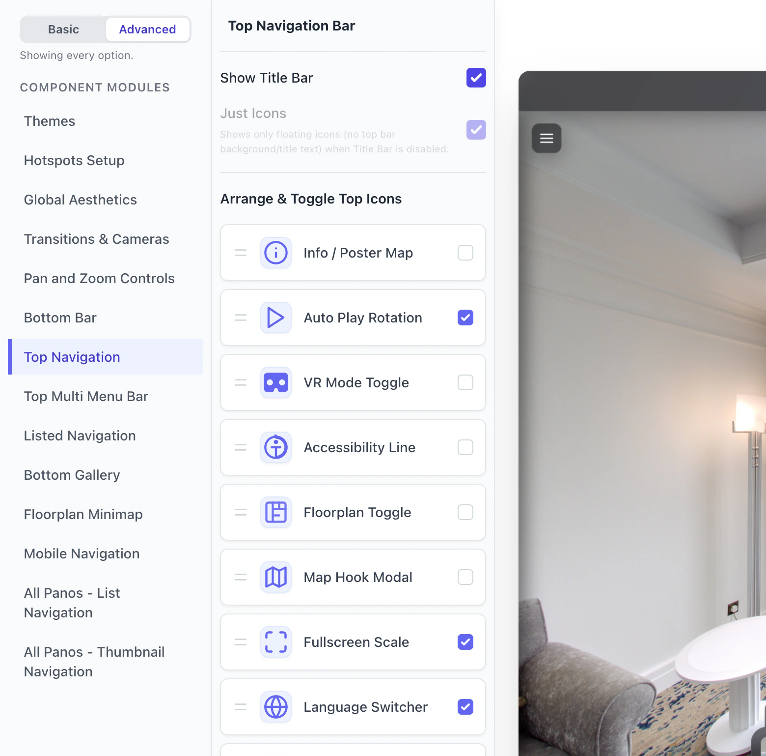
Top Nav Bar - Dropdown. With Show Title Bar off, the icons ticked under Arrange & Toggle Top Icons still float on their own at the top right, in the list's order and in the tour's colors (the language switcher shows only in the bar). Just Icons, on Advanced, is on by default; untick it too and the top bar and those icons are gone. If you use the Top Nav Bar - Multi Menu, it can carry the same icons.
Side Nav - List Menu. The word above its list of rooms starts as Menu. On Advanced, type your own in Menu Title, or untick Show Menu Title to leave the word out and give the list its room.
Style per bar. The panels of the Top Nav Bar - Dropdown, Icon Bar, Side Nav - List Menu and Pan and Zoom Controls each end with Enable Custom Styling (on Advanced): tick it to color that bar apart from the rest. Brand colors explains the global colors.
On a phone
When the player is 768 pixels wide or narrower, a phone or a narrow embed, it switches to its phone layout, and Mobile Navigation sets what the phone's bars hold. At that width the Floorplan Minimap is not shown, and with the default settings the Icon Bar and the Bottom Nav - Thumbnails strip are not shown either. To show the strip on a phone, tick Bottom Nav - Thumbnails under Top Bar Features in Mobile Navigation; under Bottom Bar Features the same item is a button that opens the thumbnails.
What visitors get
- These panels shape the default layout of the current player (engine v2). On a Free plan a tour in a free theme, the Default Theme, shows visitors your own settings. A tour in a Pro theme that has never been hosted shows visitors the free Default look on its public page, so they see its bars whatever you switched: the Top Nav Bar - Dropdown, Bottom Nav - Thumbnails (with two or more scenes) and the minimap (with a floor plan). A paid plan (Pro, Agency or Enterprise), or a Vault that hosts the tour or has hosted it, shows your own settings in any theme. The Design tab, the preview beside the panels and the Preview tab always show them.
- Save & Render refreshes the stored copy that visitors get, unless the tour uses Draft Workflows: then nothing reaches them until you click Publish Changes. The Explore page loads the player only after its play button is clicked. My changes do not show for visitors has the rest.
Troubleshooting
I cannot find an option. The Design tab is in Basic. Click Advanced.
I switched a bar on, but visitors do not see it. Check the plan and the stored copy (above). Then check what the module needs: Bottom Nav - Thumbnails needs two scenes, the minimap needs a floor plan, and the menu bar needs at least one item (The bar shows up once the menu has at least one item.).
The tour looks different on a phone. See On a phone.
There are two sets of icons at the top. The Top Nav Bar - Dropdown and the Top Nav Bar - Multi Menu can both show icons: see Build a Top Nav Bar - Multi Menu.
I turned the bars off and Panoramr's logo is still there. The start screen and the round badge on the floor are not bars: see Remove Panoramr branding.
Next steps
Was this article helpful?